Debunking the Netflix slider
Sliders, sliders, sliders... a UX pattern we are all so familiar with. For developers there are really good packages out there with super simple API's and customizability to implement into your project however, depending on the needs, being bound to a package can bite you in the ass in the future. We also don't want to get to the point of 'hacky' workarounds to break out of the limitations.
At one point in my career as a junior it made sense to me why some seniors I worked with built everything from scratch. At first I'd be like, wtf... why re-invent the wheel?! There is a package for that. But I quickly understood that it forces you to fully understand what is really going on under the hood and better yet, you can build it exactly the way you want. Like any feature, I recommend anyone to look into building something from scratch because the learnings from it will be priceless.
Problem statement
Getting back to the point. Once upon a time I worked on a product that demanded 'Netflix' like sliders to showcase their huge portfolio of media. I thought alright easy. I had already had my fair share of sliders built under my belt so how difficult could it be. Being on a somewhat tight deadline we still opted for building a custom slider to make sure we wouldn't be constrained by any limitations. Soooo... we started the process taking the client's requirements into account.
Slider requirements
- The slider needs to scroll infinitely.
- It needs to be navigable using controls. I am not going to argue with Netflix opting for controls instead of horizontal scroll snap. They probably invested millions into their UX research.
- When navigating, we need to move the items per set amount of slides in view.
- It needs to work on all screen sizes.
- The items in the slides should be able to support any aspect ratio.
So I started building and the results were great... It had all the features that were demanded. Cool. But as the content grew and more sliders were added on the accept environment to build up the page which solely consisted of just sliders I quickly realized we were running into huge performance issues. Well shit... I mean, there is a whole engineering department of top developers at Netflix that optimized and iterated the shit out of their sliders and here I am tasked to make it happen within 2 sprints.
Oh shit realization.
So what were the issues the slider was experiencing?
- Each slider was pumped up with around 30-40 items. For one slider, on the page cool, but if your page consists of 10 sliders +, then thats a hell of a lot of DOM nodes.
- For responsiveness, every item was given a width in px that was calculated in JS based on the amount of sliders to be in view and viewport width. This is waaaay to expensive since it causes reflows.
- The way infinite navigation was implemented was by adding dummy groups of items at the beginning and the end the total items. This was done to get that seamless infinite loop. However, this added even more DOM nodes to our document.
- Every item in a slider grew to be quite complex. A single item had rich metadata that sometimes needed to be parsed. It had to be aware of its position when in view to pop out a child from the left, center or right and images had to be lazyloaded.
So there I was, launch date was getting close and I am starting to break a sweat. Up against the marvel of Netflix's godly slider which I now started to realize does way more magic than meets the eye. Shiii...
Analyzing the Netflix slider
So it became apparent that some sort of 'virtualization' technique had to be applied to combat the dom nodes issues and fix performance. There are packages out there for react but most of these packages were made purely for large datasets that render simple lists. Our 'list items' in that sense were complex. See for example ReactWindow and ReactVirtualized.
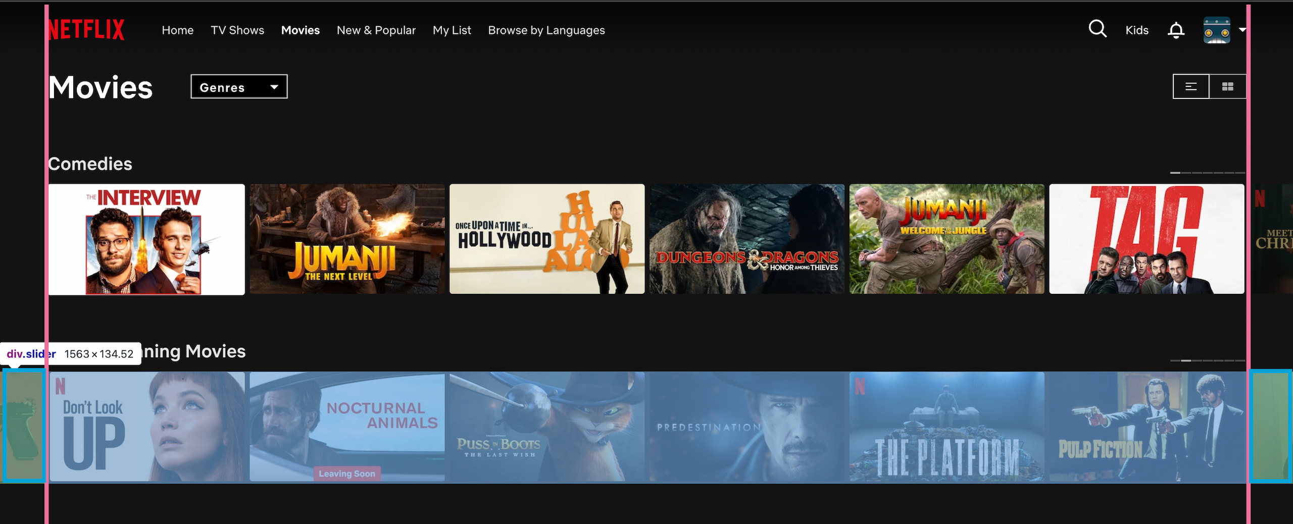
A look at the their slider.

- The peeking items are aligned exactly to the page padding. What you sometimes see is that on navigating, the items dissapear into the overflow hidden which is not what we want.
- 6 items are in view. On navigating it moves left or right per 6 items.
- The items maintain their aspect ratio on viewport width change.
How they 'virtualize' items
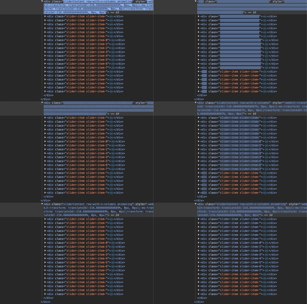
As you can see, upon navigating through a slider, there is always a fixed amount of dom nodes. With 6 items in view, they have 2 peeking items. One on the left and one on the right. The items on the left before item-0 are the out of viewport items on the left and the ones after item-7 on the right.
After a navigation is done, they replace the contents of the nodes outside the viewport with new content and voila. You keep a fixed amount of nodes. So with 6 items in view we need:
- 6 items in view + 2 peeking items
- 6 items out of viewport on the left
- 6 items out of viewport on the right
- An item width is % based so the browser handles setting the width.

Ok so now we know whats happening how the hell do we achieve this?
Implementation
I scratched my head really long on this one until I thought of Framer Motion's AnimatePresence. This API is perfect for our use case since it allows components animate out before removal from the DOM - exactly what we need for that seamless infinite loop.
The final implementation achieves:
- Constant DOM node count regardless of dataset size.
- With a total of 20 items, showing 4 items in view, we generate a total of 6 dom nodes.
- Responsive layout without JS calculations.
- Infinite looping.
Here's our new slider in action:
Let's break down the key parts of our implementation:
Core Configuration
const TOTAL_ITEMS = 20;   // Total items in the dataset
const PEEK_ITEMS = 1;     // Items peeking on each side
Dynamic visible items
Instead of hardcoding visible items, we use TailwindCSS custom css variables to handle this responsively.
[--visible-items:3]        // Default: 3 items
md:[--visible-items:4]     // Medium screens: 4 items
This is retrieved in JS when needed:
const visibleItems = containerRef.current
  ? Number.parseInt(
      getComputedStyle(containerRef.current)
        .getPropertyValue("--visible-items")
    )
  : 3;
Responsive layout magic
Instead of JavaScript calculations, we use CSS custom properties for fluid layouts.
<div
  className="relative w-full overflow-hidden
    [--grid-gap:0.5rem]
    [--padding:3rem]
    [--visible-items:3]
    md:[--visible-items:4]"
  style={{
    "--gap-to-include": "calc(var(--grid-gap) / var(--visible-items))",
    "--item-width": "calc(100% / var(--visible-items) - var(--grid-gap) + var(--gap-to-include))"
  }}
>
This approach lets the browser handle width calculations and responsive behavior. No JS recalculations on resize!
We need to calculate the --gap-to-include because our item width calculation needs to include the css gap set which is not included.
This compensates for the space lost to gaps by adding a fraction of the gap width back to each item, ensuring the total width is exactly 100%.
Virtual window management
The core of our virtualization uses a smart windowing system:
const getVisibleMovies = useCallback(() => {
  const visibleItems = containerRef.current
    ? Number.parseInt(getComputedStyle(containerRef.current)
        .getPropertyValue("--visible-items"))
    : 3;

  const start = currentIndex - PEEK_ITEMS;
  const end = currentIndex + visibleItems + PEEK_ITEMS;

  return Array.from({ length: end - start }, (_, index) => {
    const movieIndex = (start + index + TOTAL_ITEMS) % TOTAL_ITEMS;
    return { ...movies[movieIndex], key: `${movieIndex}-${currentIndex}` };
  });
}, [currentIndex]);
Handling the animation
The animation magic happens through Framer Motion's variants. mode="popLayout" allows the new track to be animated in absolutely so it can be layered. The 200% both ways ensures the item fully exits the viewport.
<AnimatePresence
  initial={false}
  custom={direction}
  onExitComplete={handleAnimationComplete}
  mode="popLayout"
>
  <motion.div
    key={currentIndex}
    variants={{
      enter: (direction: number) => ({
        x: direction > 0 ? "100%" : "-100%",
      }),
      center: { x: 0 },
      exit: (direction: number) => ({
        x: direction > 0 ? "-200%" : "200%",
      }),
    }}
    transition={{ duration: 0.64, ease: [0.16, 1, 0.3, 1] }}
  >
Navigation logic
The slider's infinite navigation relies on two key pieces:
1. Index Calculation
const handleNavigation = useCallback((newDirection: number) => {
  if (isAnimating) return;

  setIsAnimating(true);
  setDirection(newDirection);
  setCurrentIndex((prevIndex) => {
    const visibleItems = containerRef.current
      ? Number.parseInt(
          getComputedStyle(containerRef.current)
            .getPropertyValue("--visible-items")
        )
      : 3;

    // Move by full page of items, wrapping around using modulo
    const newIndex = (prevIndex + newDirection * visibleItems + TOTAL_ITEMS) % TOTAL_ITEMS;
    return newIndex;
  });
}, [isAnimating]);
Let's break down that index calculation:
newDirection * visibleItems: Move forward/backward by full page+ TOTAL_ITEMS: Ensure positive number when moving backward% TOTAL_ITEMS: Wrap around to start/end
For example, with 20 total items and 4 visible items:
- Forward from index 16:
(16 + 1 * 4 + 20) % 20 = 0 - Backward from index 2:
(2 + -1 * 4 + 20) % 20 = 18
2. Virtual window adjustment
const getVisibleMovies = useCallback(() => {
  // Get current visible items count
  const visibleItems = containerRef.current
    ? Number.parseInt(getComputedStyle(containerRef.current)
        .getPropertyValue("--visible-items"))
    : 3;

  // Calculate window boundaries
  const start = currentIndex - PEEK_ITEMS;
  const end = currentIndex + visibleItems + PEEK_ITEMS;

  // Create array of correct length and map to actual items
  return Array.from({ length: end - start }, (_, index) => {
    const movieIndex = (start + index + TOTAL_ITEMS) % TOTAL_ITEMS;
    return { ...movies[movieIndex], key: `${movieIndex}-${currentIndex}` };
  });
}, [currentIndex]);
The virtual window ensures we always show:
- Current visible items (3 or 4 depending on screen size) for this example
- 1 peeking item before and after visible items
This combination creates the illusion of infinite content while maintaining a fixed DOM size.
Lessons learned
I think we did it? No js recalculations on resizing, seamless infinite looping while keeping a minimum dom size per slider. The dream. I think it's super neat to be able to use css variables that way and override the variables using media breakpoints. What did we learn from this?
- Offload as much to css as you can.
- Strive for as little layout shifts as possible on page init.
- Keep a low fixed number of nodes.
- Critically think about the 'production' data load and structure before diving into a feature.
One thing to note is that if you need all your item's SSRed in the slider for SEO, this probably won't be the right solution. Only your initial items in view will be rendered in the source so you'd have to be picky in selecting content for crawling.